Spurling Cannon Case Study
For one of our more recent website builds, a leading accountancy firm in Kent reached out to see if we could rebuild their website.
Chloe approached our team with the tricky task of rebranding an already incredibly popular business!
Chloe’s Hair Design had previously won Best Salon Team twice in the 2 years that they’d been open, had trained and qualified two apprentices onto the shop floor and had won industry awards for Best Colour Salon, Best Salon East Kent, Best New Salon, Contribution to the Community and Kent Women in Business.
Here was the original inspiration from Chloé:
LOVE
HATE
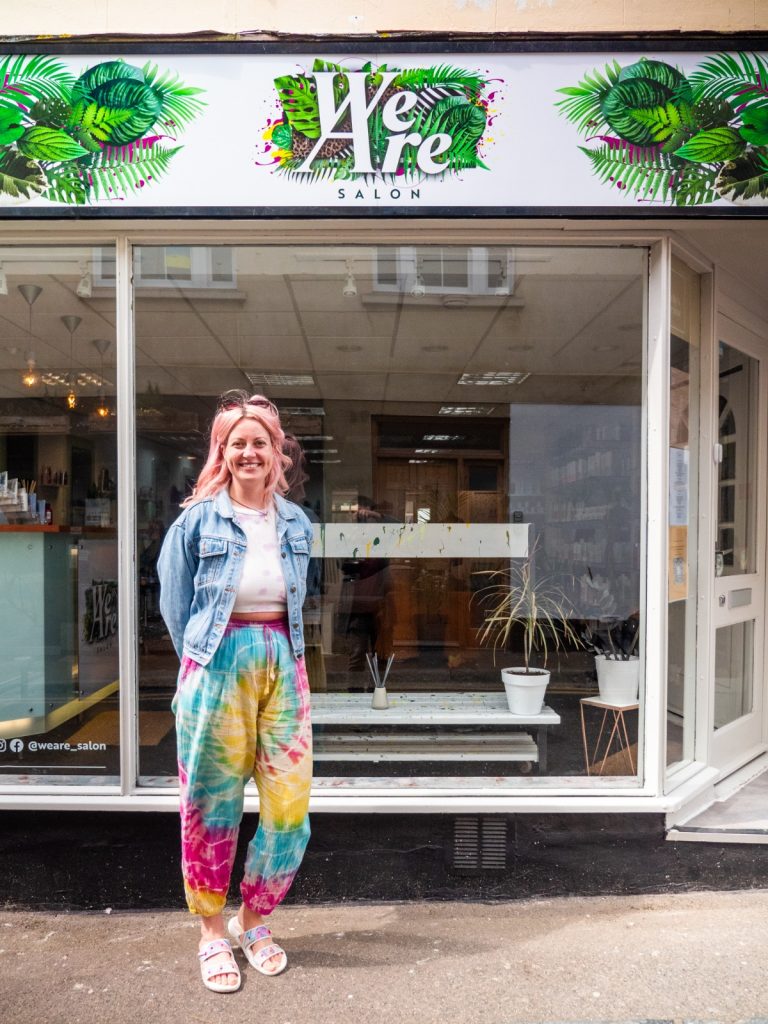
We created this concept focusing individually on the ‘We’ & ‘Are’. We selected a typeface and began to develop this into a stylish logo that can easily be scaled down using the ‘WA’ as a brand mark.
A main point of focus that needed attention, was adding thickness to the strokes in the typography so that it would not be lost when printing at small scales or once being placed on top of a busy background. This was achieved whilst keeping the edges thin and sharp to keep the classy look within the type.
The next stage of the process was to scale up the minimal ‘We Are’ logo into a bright, vibrant and artistic version that can be used on large scale prints and digital assets e.g. websites, banners, signage.
We carefully selected elements using inspiration from nature, whilst taking into account areas the client loved in the brand vision. This version was revised multiple times while continuing to consult with the client, experimenting with different versions of colour, shapes and imagery until we reached our final design.
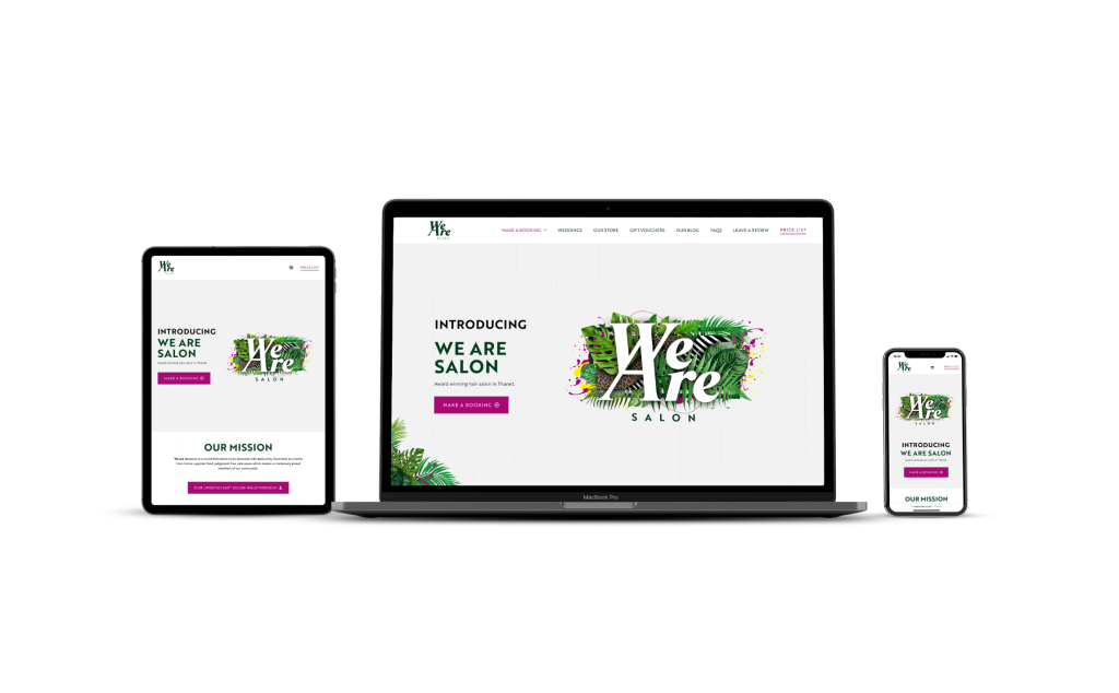
One of the highest search engine ranking hair salons in Thanet, Kent.
We Are Salon hosts a warm, welcoming space, full of positive energy, where beauty salon services are provided in Ramsgate, Kent.
Featuring rich vibrant media throughout, the We Are Salon website shows off their new logo using a full-width hero section, with 3D tilt mouse tracking, motion effects, and a series of entrance animations for the content flowing down the page.
Visible throughout the website are meticulously positioned foliage graphics we created, designed to compliment the logo.

For one of our more recent website builds, a leading accountancy firm in Kent reached out to see if we could rebuild their website.
The Bank Job Escape Rooms & The Counting House hold a special place in our hearts, they were one of our first clients!
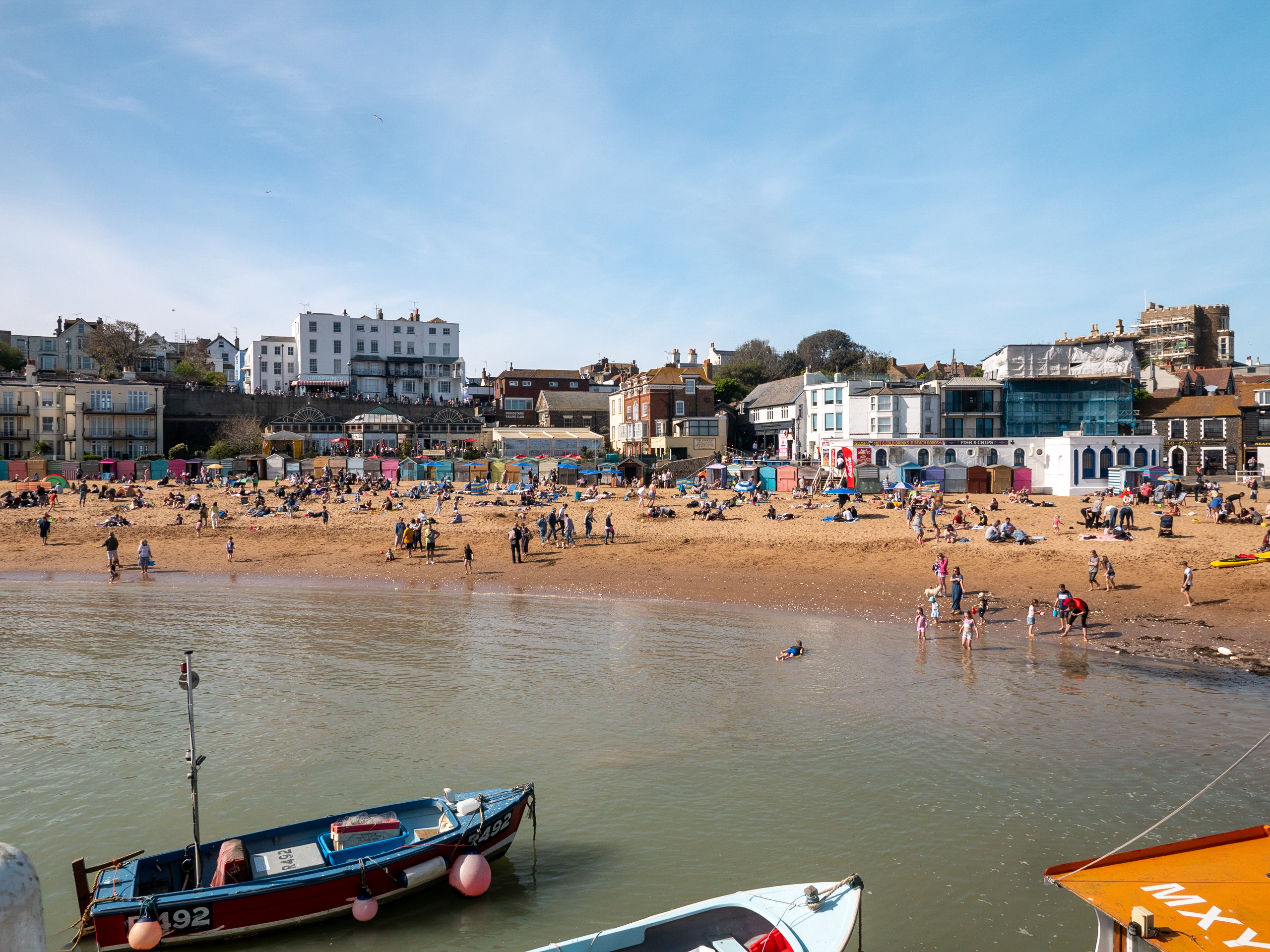
Harding-Lee Media volunteers their services for the Broadstairs Tourist & Leisure Association (BTLA).
Book a call with us today for a free consultation